Documentation
Video Demos
Documentation is also covered in the Videos.
Installation
Install the Browser Extension from the Chrome Web Store.
Once you've left the chromewebstore.google.com domain, open the DevTools and click on the “🎨 CSS Variables” pane.
View Colors
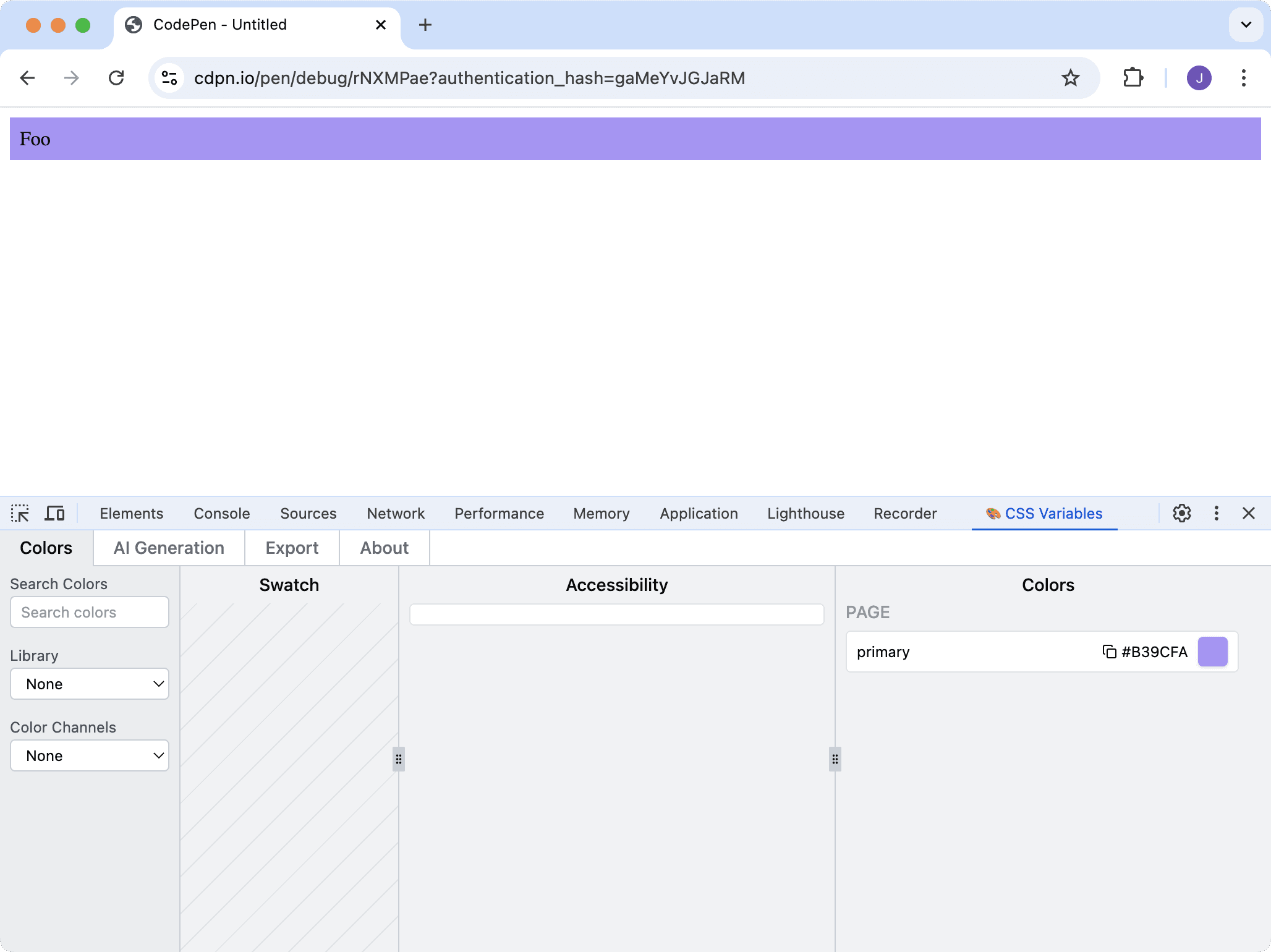
All global CSS Variables that are valid colors will be shown in the Extension.
:root {
  --primary: #845EF7;
}

.foo {
  background: var(--primary);
}
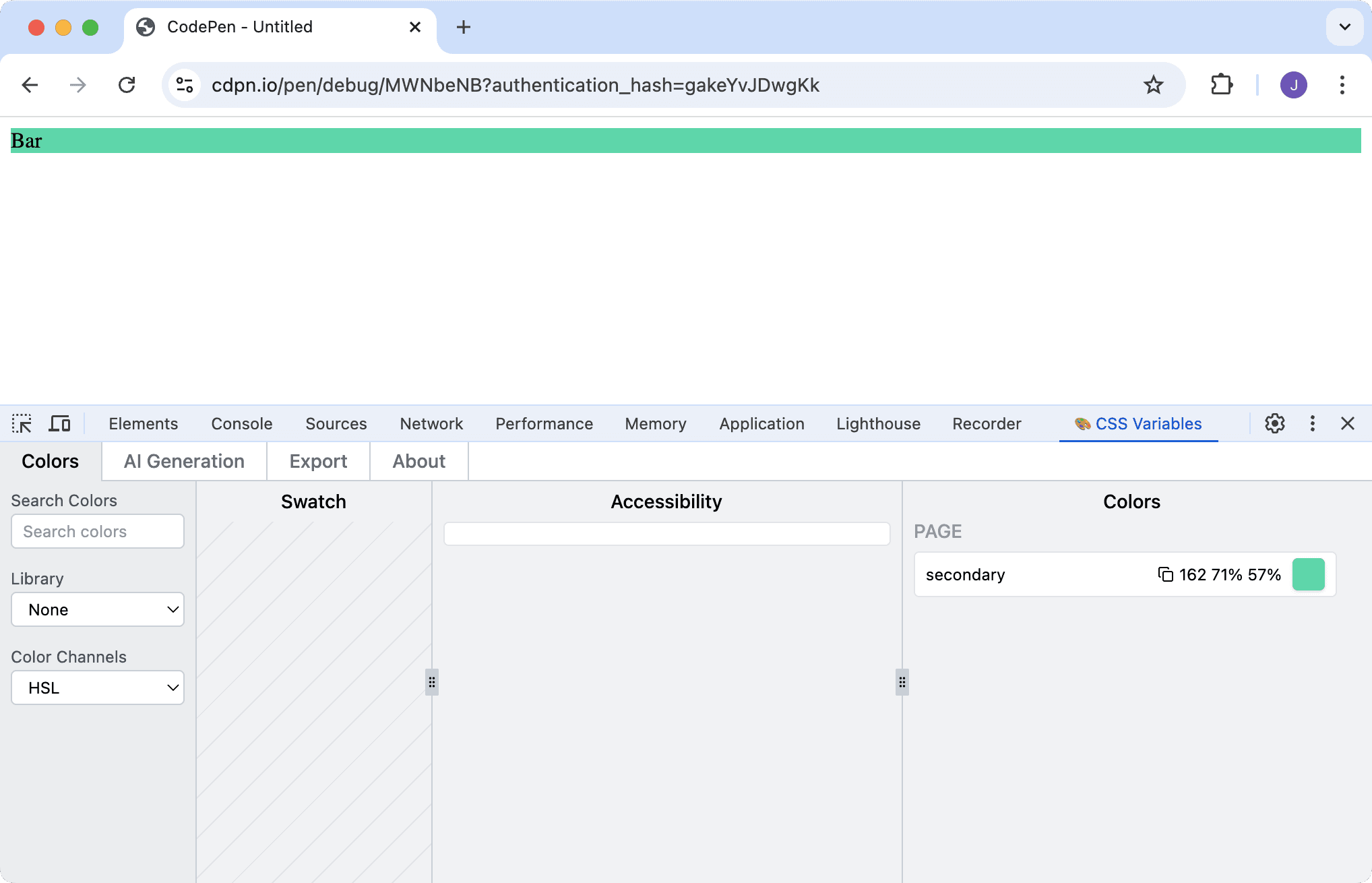
Colors can also be defined as HSL or OKLCH channels.
There are many reasons why you might want to do this eg Tailwind CSS requires this for it's opacity modifier.
:root {
  --secondary: 162 71% 57%;
}

.bar {
  background: hsl(var(--secondary));
}
For these to be recognized choose HSL or OKLCH in the “Color Channels” select list in the leftmost column.
Edit Colors
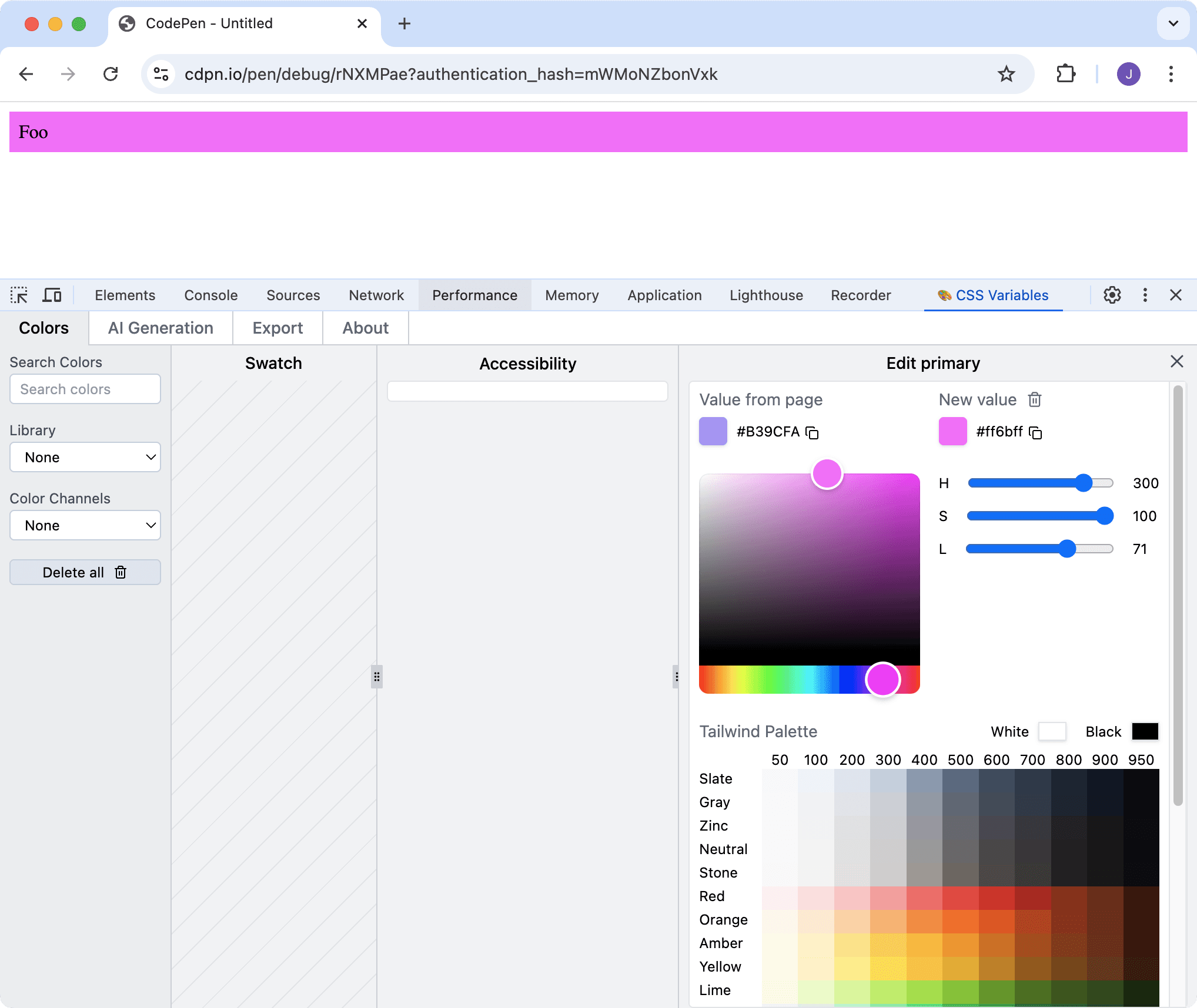
Changing a color in the Extension updates that CSS Variable in the page.
This can be done with:
A color picker.
- Per individual color channels (HSL or OKLCH depending on the original format).
- Chosen from Tailwind's default palette (regardless if whether you’re using Tailwind).
UI Libraries
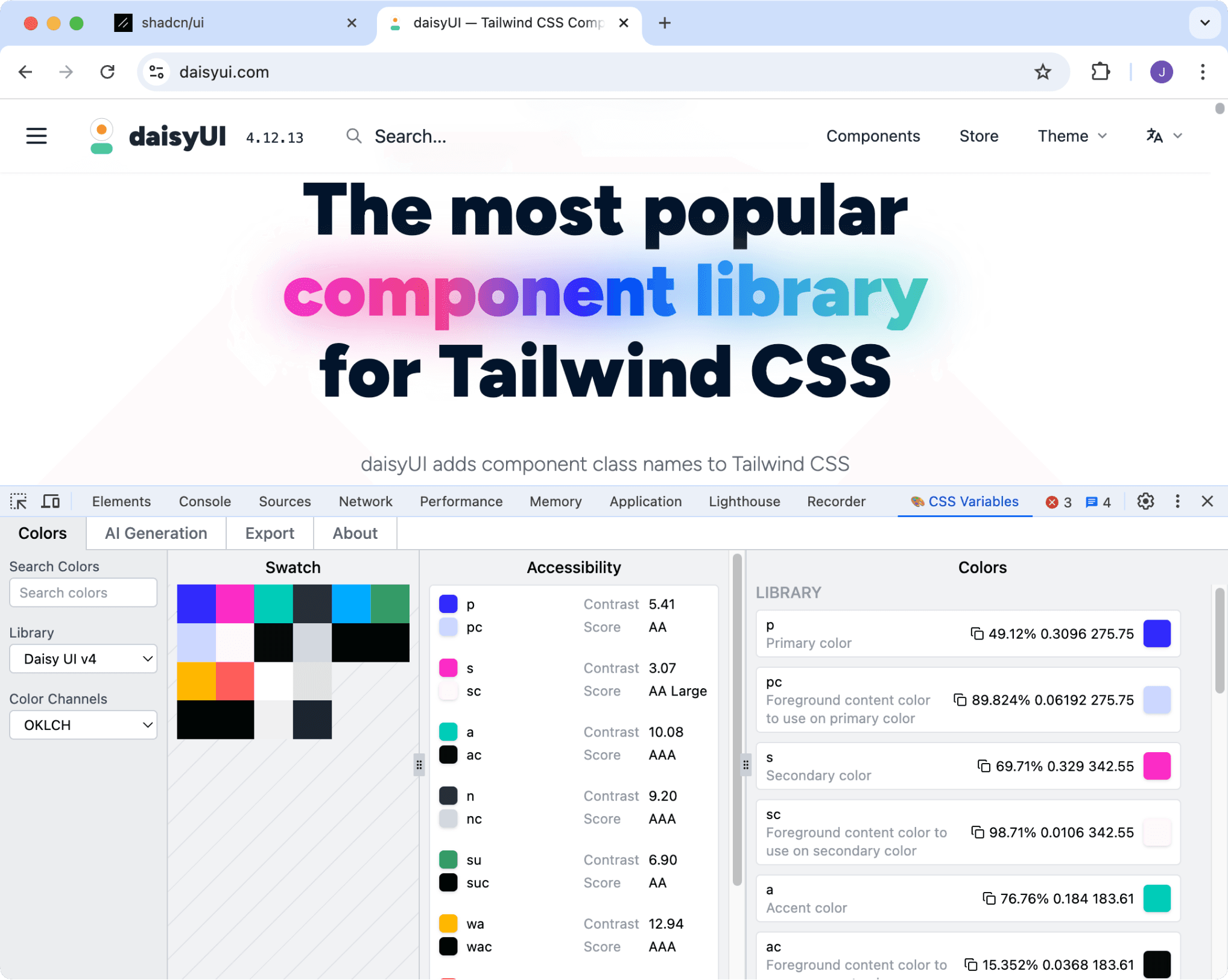
Currently shadcn/ui and daisyUI are supported. If you'd like a different UI library to be added contact me.
Choose the library you're using from the "Library" select list in the leftmost column.
You will now have additional features:
Swatch for easily viewing the color palette.
- Accessibility Panel showing the contrast of colors that are used together (according to WCAG guidelines).
- Colors List will have semantic descriptions (coming from the UI library's documentation).

AI Generation
The Extension can generate new color palettes with AI and update the website you're looking at in real-time.
- Enter a User Prompt eg “Create a color palette inspired by a tropical rainforest"
- Change the Temperature and Top P for more or less randomness in the generations.
- Add your API key for OpenAI or Anthropic.
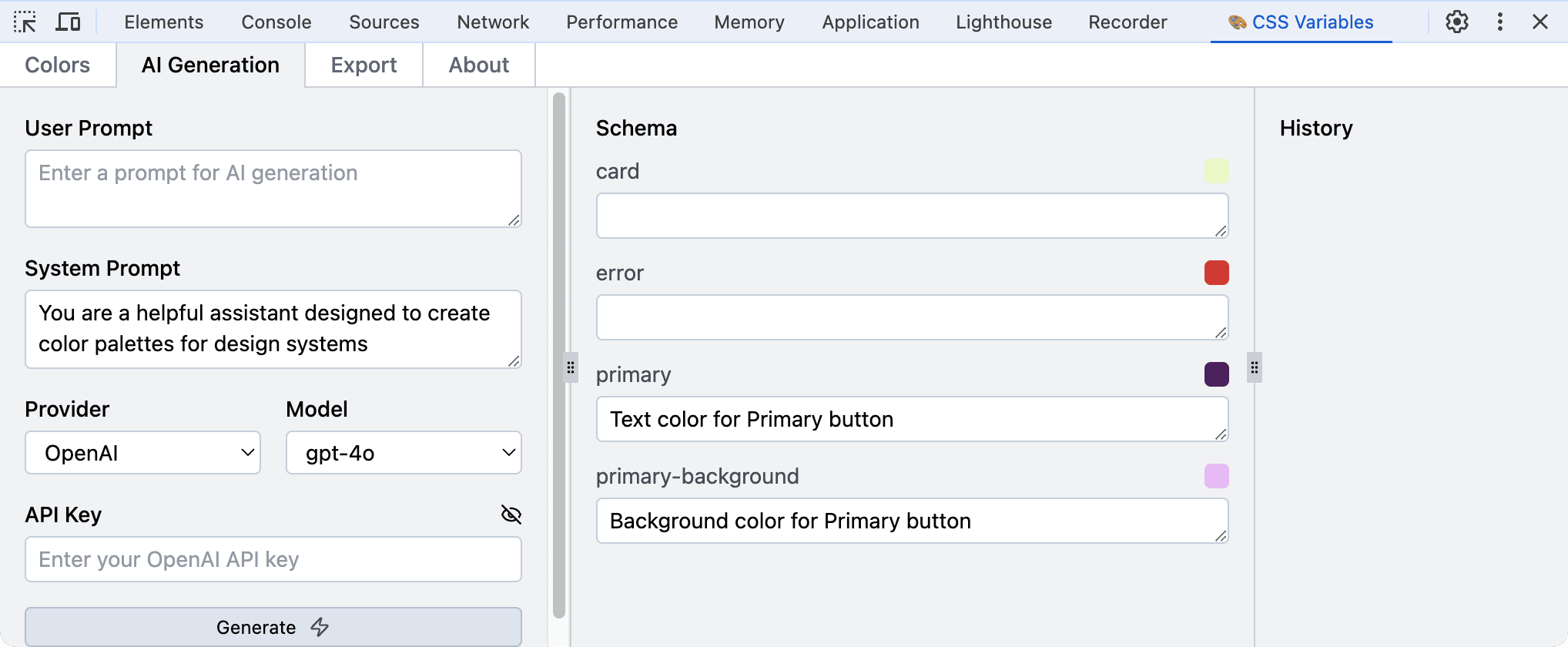
- The Schema panel shows the descriptions that will be passed to the AI to give it context of how the colors will be used (via Function Calling).Default values come from the UI library if using shadcn/ui or daisyUI, or the Custom Configuration if supplied.You can also set descriptions manually.
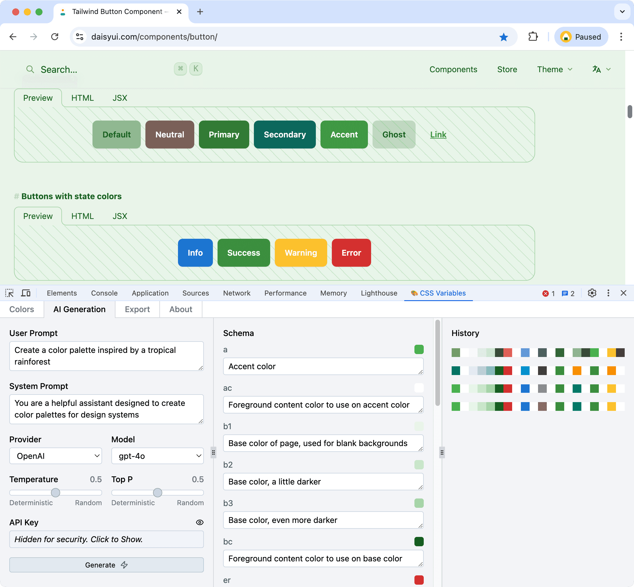
The History panel shows previous AI generations and these can be clicked to be applied again.
* If you've just signed up for an OpenAI account you may not have access to all of the models immediately. Please check the OpenAI Playground for more information.
Tip: After generating a new palette you may want to go back to the Colors page and check the Accessability Panel. If a color is just failing you can tweak the lightness via the color channel sliders until it passes.Custom Configuration
You can also use the Swatch, Accessibility Panel and add descriptions to the Colors List with a Custom Configuration.
If you are using a supported UI library the Custom Configuration will override the default values.
Configuration data is passed to the Extension via stringifying a JavaScript object and putting this content in a div with a data attribute of data-css-variables-config.
Color groups / descriptions
Imagine you have these CSS Variables:
:root {
  --card: #e9fac8;
  --error:  #e03131;
  --primary: #5a1e69;
  --primary-background: #eebefa;
}
By default the extension will just show the colors:
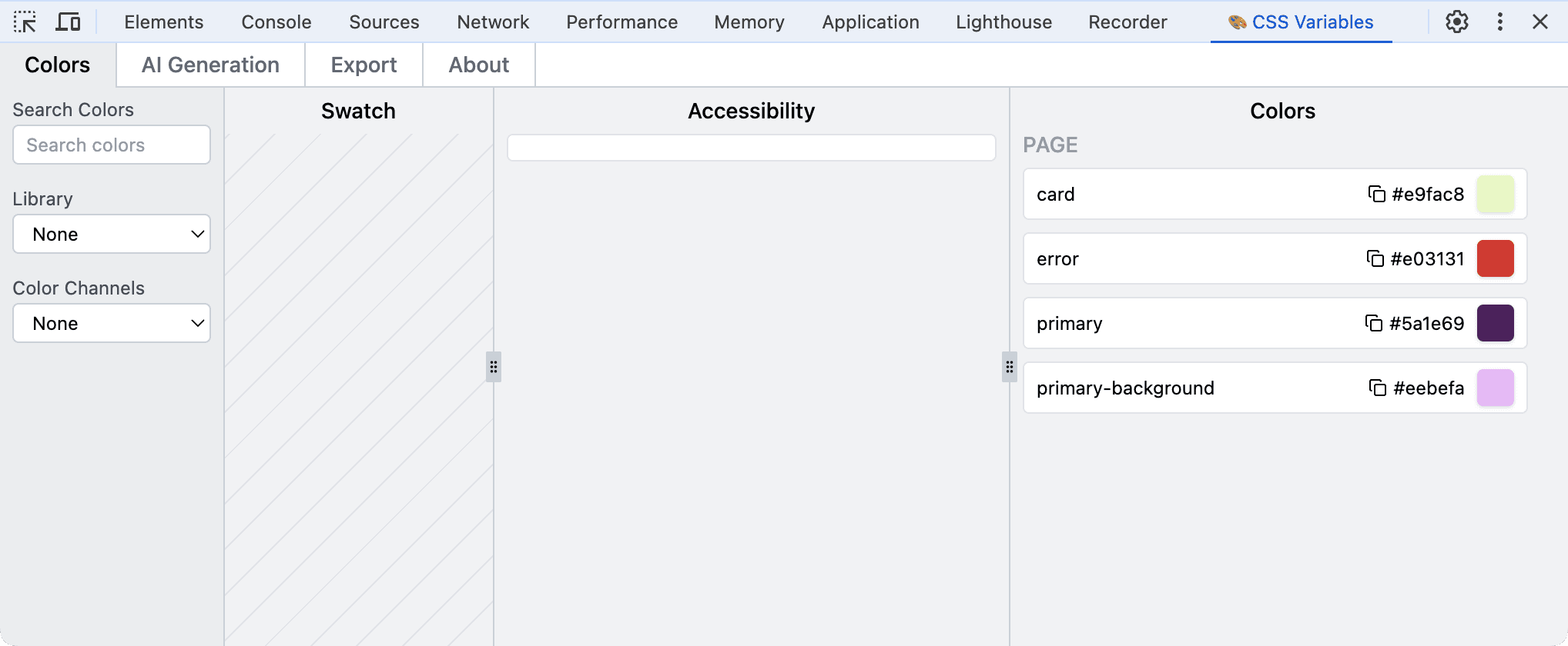
If you add 2 colors to the custom config:
const customConfig = {
  colorGroups: [{
    description: 'Primary colors to use for CTA',
    colors: [{
      name: "primary", // don't add "--" to the name. Eg "primary" references the CSS variable "--primary"
    }, {
      name: "primary-background",
    }]
  }],
}
And stringify the object, then render it on the page with a data attribute of data-css-variables-config.
// JSX example

// You probably want to hide this with CSS
<div data-css-variables-config>{JSON.stringify(customConfig)}</div>
Then the extension will have a description for the two colors:
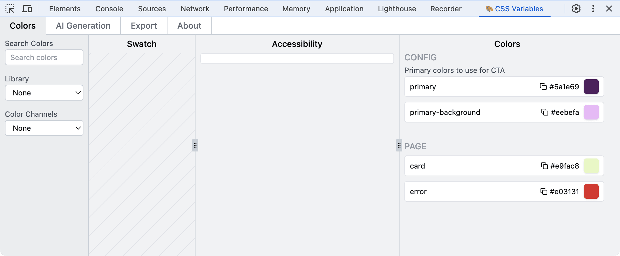
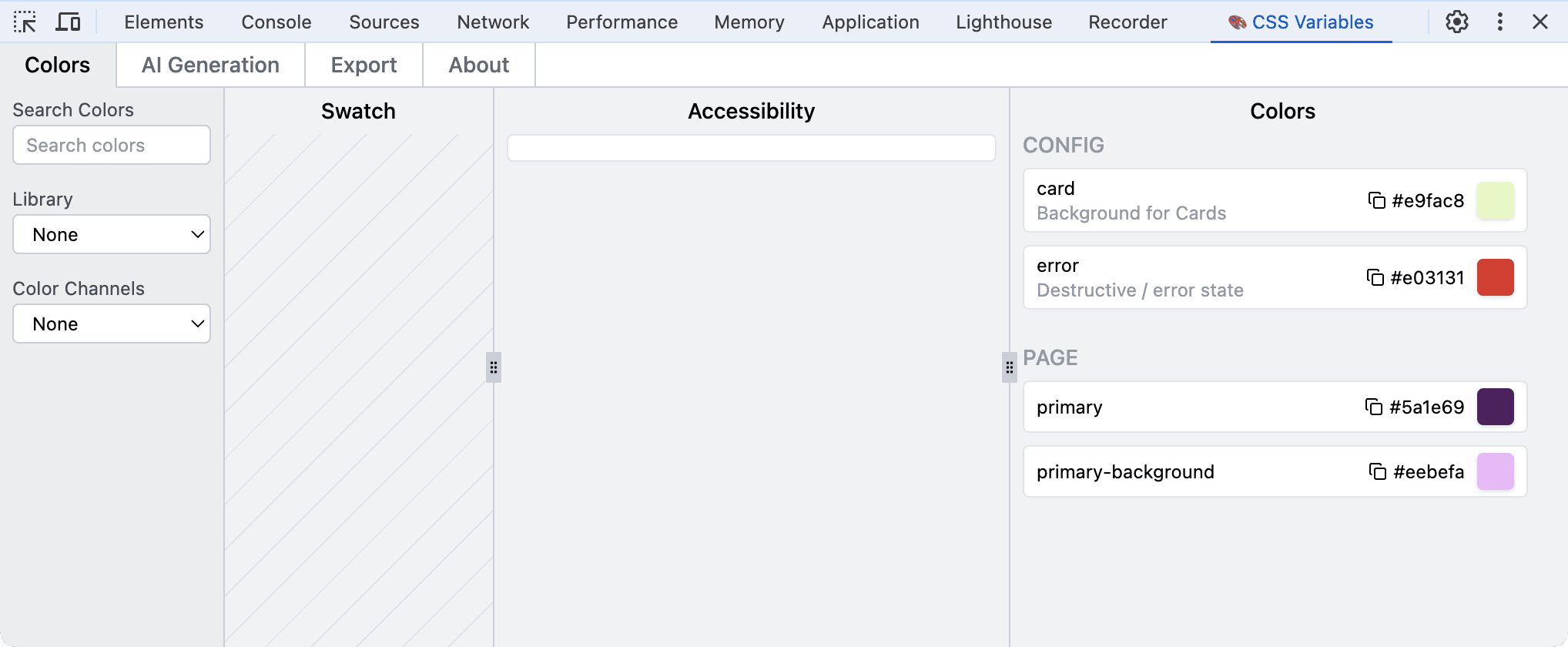
You can also have descriptions for individual colors, aswell as or instead of color group descriptions.
const customConfig = {
  colorGroups: [{
    colors: [{
      name: "card",
      description: 'Background for Cards',
    }, {
      name: "error",
      description: 'Destructive / error state',
    }]
  }],
}
In which case the Extension will show descriptions for each color:
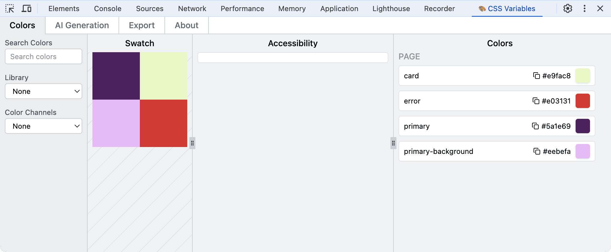
Swatch
You can add any colors that you wish to appear in the Swatch panel.
const customConfig = {
  swatch: ['primary', 'primary-background', 'card', "error"],
}
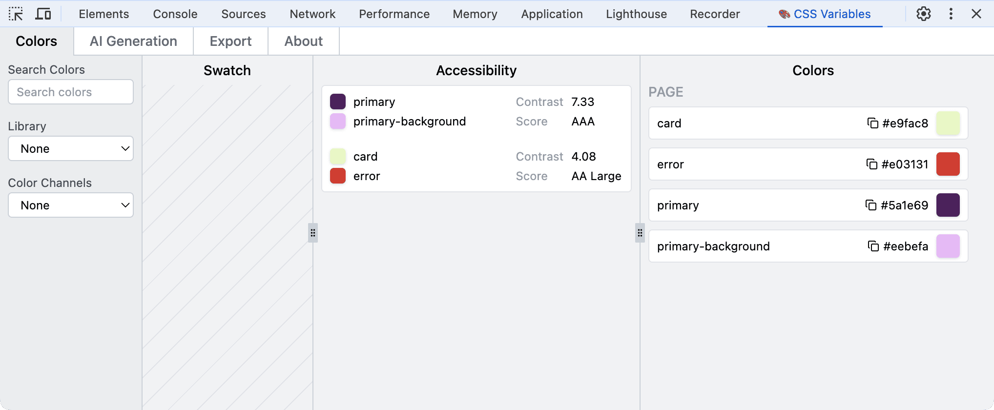
Accessability
To see the color contrast score add colors as pairs.
const customConfig = {
  accessibility: [
    ['primary', 'primary-background'],
    ['card', 'error']
  ],
}
Settings
You can set the Library and Color Format.
const customConfig = {
  settings: {
    library: 'shadcn',
    colorFormat: 'hsl',
  }
}
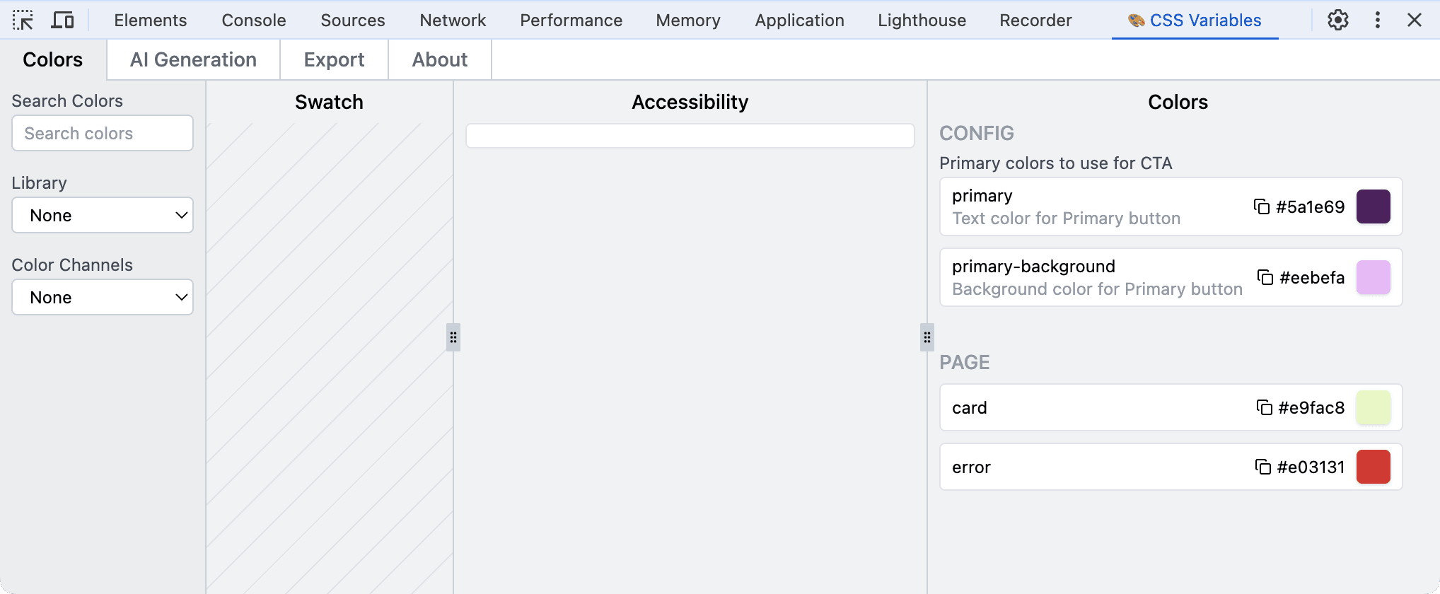
You can also hide the individual color descriptions from the main Colors List. Here is why you might want to do this:
If you have descriptions for both color groups and individual colors it may be redundant to show them both in the Colors List.
const customConfig = {
  colorGroups: [{
    description: 'Primary colors to use for CTA',
    colors: [{
      name: "primary",
      description: 'Text color for Primary button'
    }, {
      name: "primary-background",
      description: 'Background color for Primary button'
    }]
  }],
}
However as individual color descriptions are used for the AI-generation you may wish to hide them from the Colors List rather than remove them altogether.
const customConfig = {
  colorGroups: [{
    description: 'Primary colors to use for CTA',
    colors: [{
      name: "primary",
      description: 'Text color for Primary button'
    }, {
      name: "primary-background",
      description: 'Background color for Primary button'
    }]
  }],
  settings: {
    showColorDescriptionInColorGroups: false, // default is true, unless you're using shadcn/ui
  }
}
Now individual color descriptions are hidden on the Colors List:

But individual color descriptions are still used for AI generation:
TypeScript
This is the TypeScript type for the config object:
type Config = {
  colorGroups?: {
    description?: string;
    colors: {
      name: string;
      description?: string;
    }[];
  }[];
  swatch?: string[];
  accessibility?: [string, string][];
  settings?: {
    library?: "shadcn" | "daisyui";
    colorFormat?: "hsl" | "oklch";
    showColorDescriptionInColorGroups?: boolean;
  };
};
Export Changes
After making changes you can export the new CSS Variable values to paste into your app.

This project is a work in progress so any issues or feature requests please contact me.